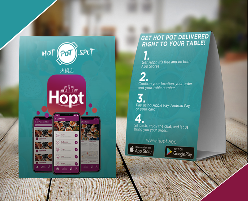
The Hot Pot Spot is a relatively new eatery located in Cardiff, Wales. Opening in September, 2018, with a focus on hot pot and other Chinese cuisine, the Hot Pot Spot is Wales' first and only a la carte hot pot restaurant. They opened with great online reviews and local acclaim, but faced a Welsh populace that knew relatively little about Chinese culture nor hot pot cuisine. When approaching this rebranding, I tried to keep in mind their four mission statements:
- Inclusive:
- Authentic:
- Social:
- Progressive:
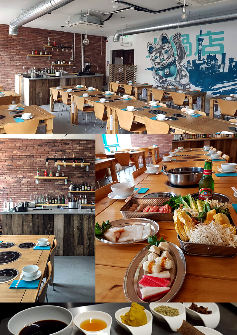
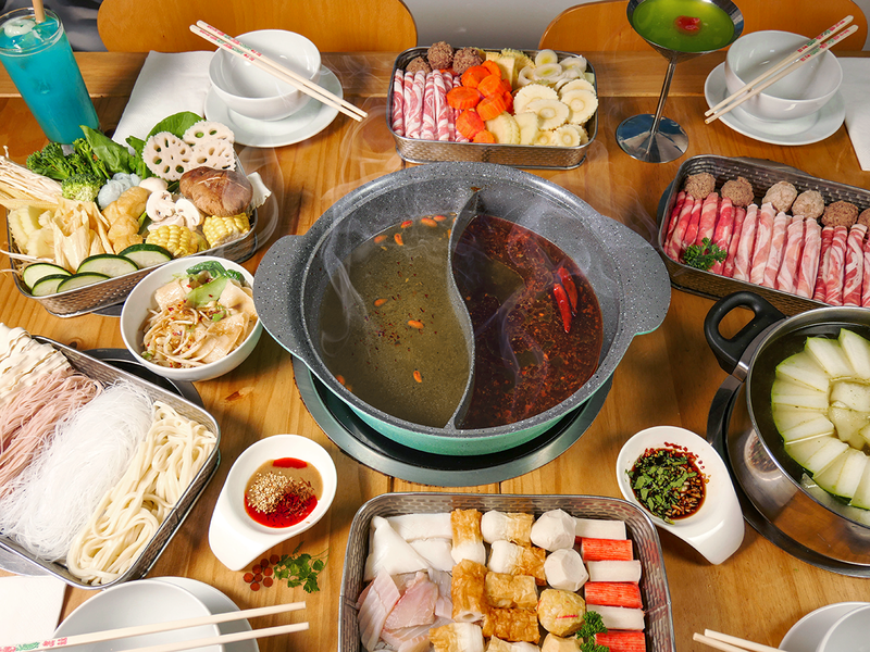
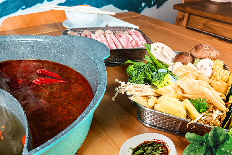
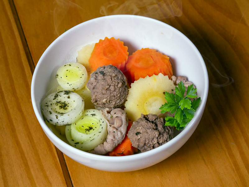
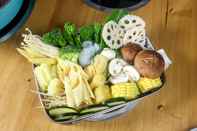
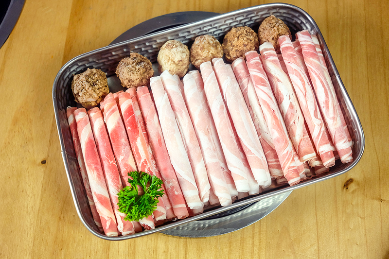
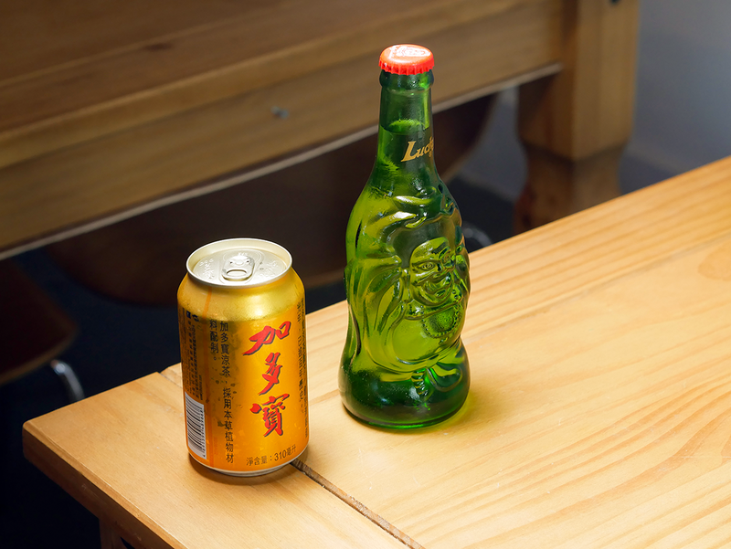
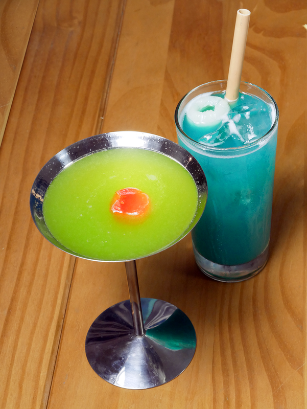
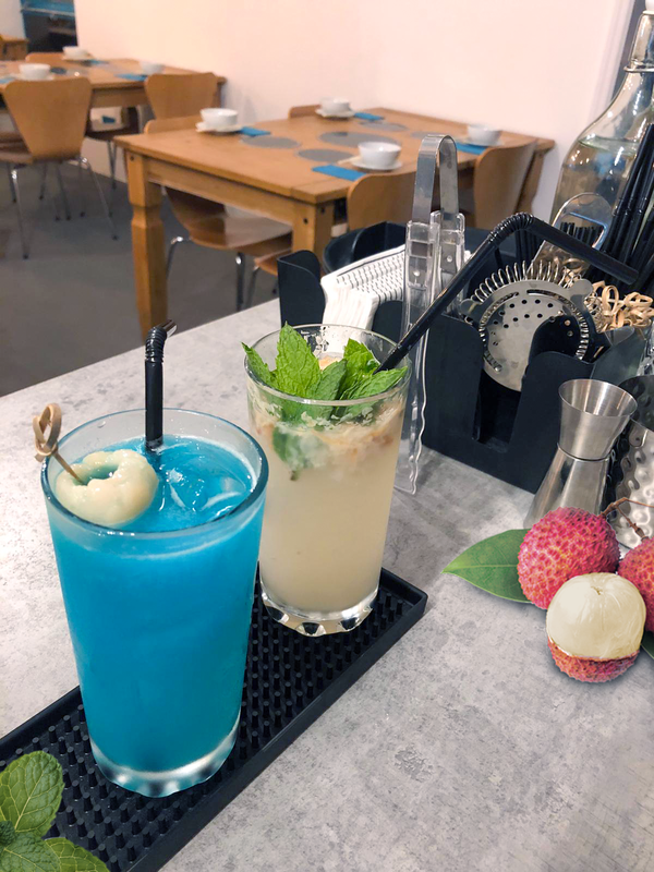
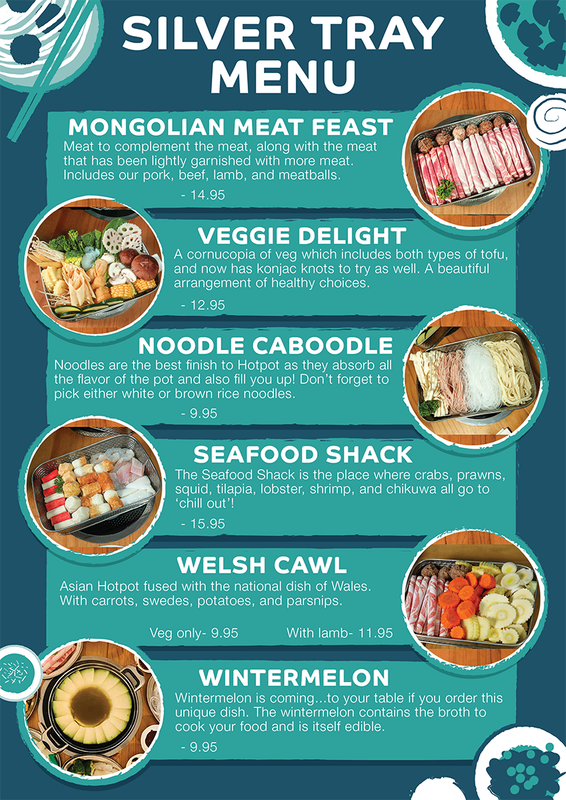
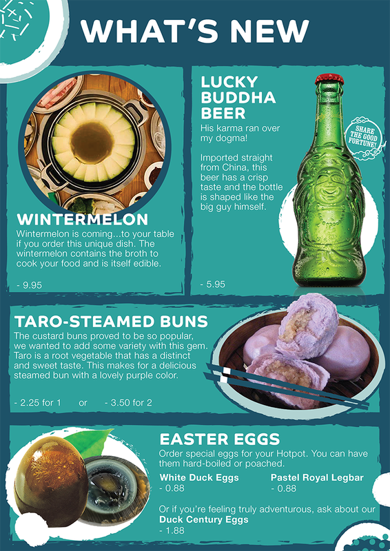
One of my first actions was to schedule a photo shoot. Though their food was delicious, there were few photographs or visual representatives for much of it. Their menu was entirely in text and some of the hot pot ingredients were not common fare. Combined with facing a brand new cuisine and cooking style, this often resulted in confusion for its Welsh patrons. Needing visuals to help stimulate their appetites, the owners got cooking and we shot a collection of their most popular dishes.
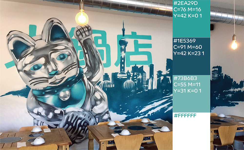
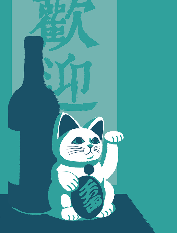
Though Chinese hot pot is an ancient and venerable traditional food, the interior veers away from overtly Chinese decor. Instead it is a clean and industrial modern feel, presided over by a Shanghai and Lucky Cat (zhāocáimāo) mural that was painted by a local Welsh graffiti artist of some renown. It was from this mural (and the owner's pride of it) that I decided to draw the Hot Pot Spot's brand colors.
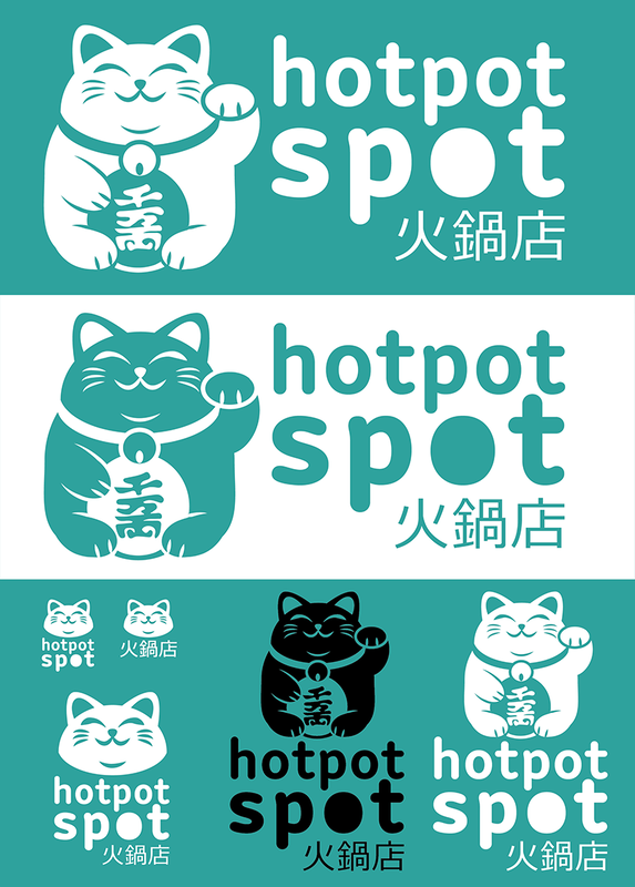
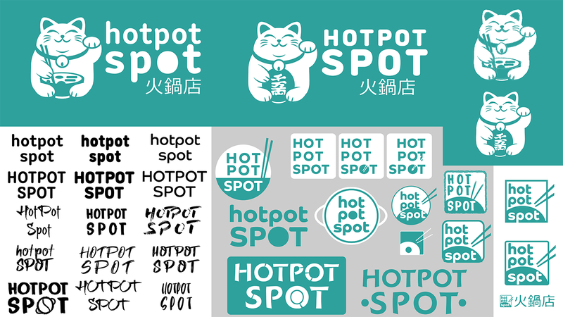
I wished to bring a new logo into play that would better match the modern aesthetic and decor. After many different ideas and iterations of the logo, I eventually decided to bring the Lucky Cat mascot forward as the logo's main iconography. The owner chose the more traditional coin-holding cat, which I then paired with the lower case 'hotpot spot', so the font's arms could help frame the Chinese hanzi.
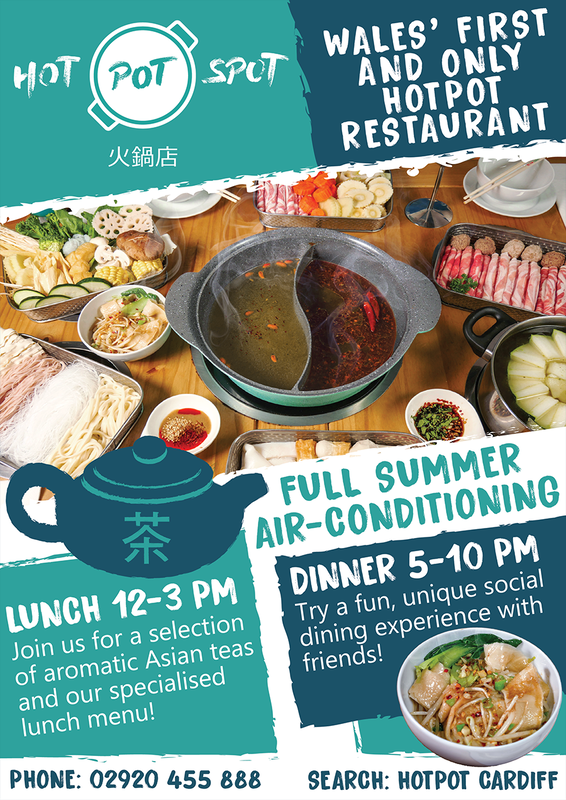
I also began work on several variations of posters and marketing flyers, when it was requested that I possibly make some matching interior design for the walls opposite the mural. The owner did request some versions using his current business logo, so they could be hung immediately. Staying within brand colors, I chose an illustrative torn-paper vector style that seemed to resonate well with the owner. He has also expressed interest in a future special large-scale window display using this style.
*IN PROGRESS
Menus, flyers, and other adverts are currently under design review/editing and are still using the old logo style until new is approved and possibly phased in, but I thought I'd show you what we're working on!

